
Product design
Designing a Customizable Toolbar: Making Screenshot Tools Fit Different Workflows
A toolbar should not show every feature by default. Its order, visible tools, and shortcuts should fit the workflow someone has chosen.
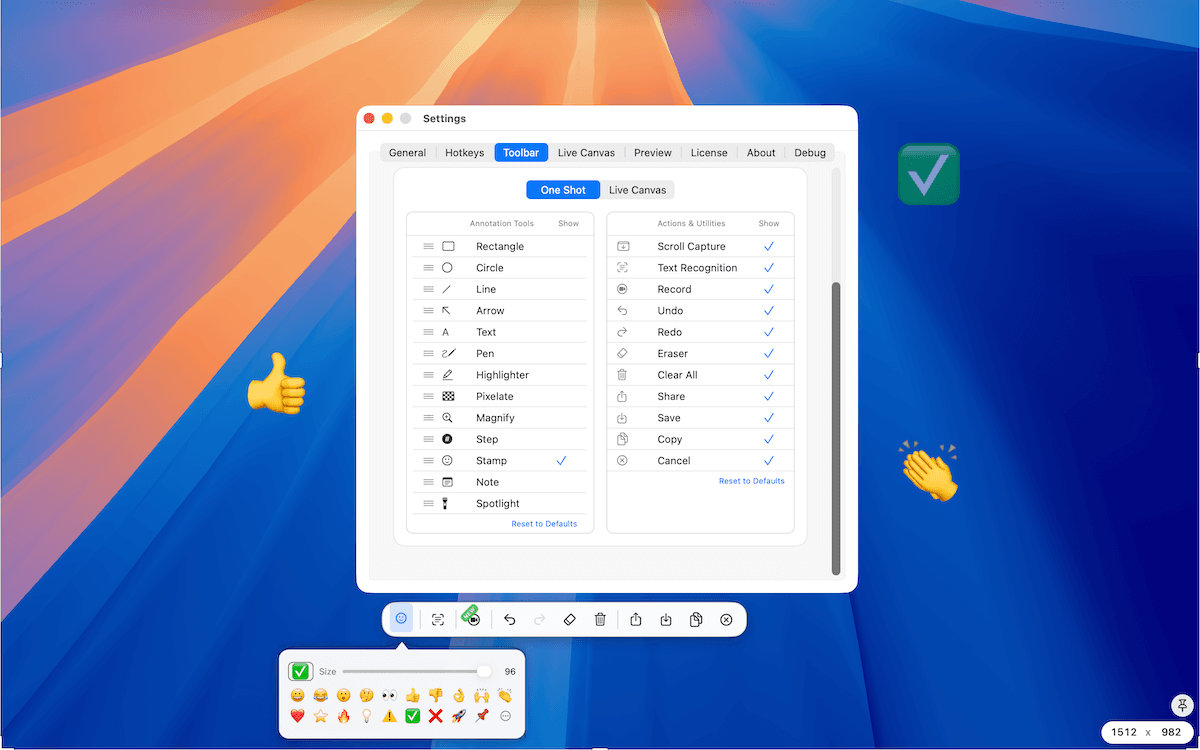
As TrarrenShot grew, the toolbar started getting crowded. That is not unusual. A screenshot tool begins with a few basic actions—rectangle, arrow, text, and pen—then adds more: highlighter, pixelate, magnify, step, note, output actions, and other workflow controls.
Every tool may have a reason to exist. But that does not mean every tool needs to be visible all the time. That was the starting point for TrarrenShot's Customize Toolbar, a Plus feature that lets people set up separate toolbars for One Shot and Live Canvas.
The idea was simple: different people use screenshot tools differently, so they should not all be forced into the same toolbar.
More tools do not always make a better toolbar
It is easy to evaluate a screenshot application by counting features: more annotation tools, buttons, and options. But after using a tool every day, the more useful question becomes: Which tools do I actually need within one click?
Someone who mainly creates bug reports may frequently use rectangle, arrow, text, pixelate, and step. Someone reviewing a design may prefer rectangle, magnify, text, and color-related tools. Someone presenting with Live Canvas may mostly need pen, highlighter, and arrow.
The other tools are not necessarily useless. They may simply not belong in that person's primary workflow. A toolbar should help someone reach the tools they need quickly, not constantly remind them of every feature the application supports.
I even hide Copy and Save
My own toolbar is a good example. I usually hide system-style output actions such as Copy and Save. Not because I do not use them—I use them constantly—but because TrarrenShot supports the familiar macOS shortcuts: Command + C to copy and Command + S to save.
Once those shortcuts become muscle memory, the buttons are no longer necessary for me. Keeping them visible takes space away from tools I am more likely to use with the pointer.
That made me think about customization differently. It is not only about personal taste. Sometimes it means removing controls that have already been replaced by a faster interaction.
The order also determines the shortcuts
Many applications assign shortcuts based on English letters: C for Circle, R for Rectangle, T for Text. That may feel natural if English is your first language, but the relationship between a letter and a tool becomes less obvious when the interface is translated.
A user working in Chinese, Japanese, Korean, French, or another language should not need to remember an English word just to understand a shortcut. TrarrenShot takes a different approach: visible annotation tools can be selected by position—1, 2, 3, 4, and so on.
If Rectangle is first, 1 selects Rectangle. If Highlighter is second, 2 selects Highlighter. Reorder the toolbar, and the number shortcuts follow the visible tool order.
The shortcut system adapts to the workflow the user has chosen, rather than making the user learn a fixed English-oriented mapping. I like how directly this connects three things: position → visual layout → shortcut. You can see where a tool is, and the number matches that position. There is less vocabulary to memorize.
One Shot and Live Canvas need different toolbars
I also did not want One Shot and Live Canvas to be forced to share exactly the same layout. They both use annotation tools, but the situations are different.
When I am working with a screenshot in One Shot, I often use Rectangle to mark an area precisely. A typical flow might be:
Capture → rectangle → text → copy.
During Live Canvas, I behave differently. I am usually explaining something in real time, so I use Highlighter much more often. The interaction is closer to:
Present → highlight → point → continue using the screen.
Because the workflows are different, the ideal toolbar can be different too. Customization is not only about personal preference; it can also reflect context.
The goal is not maximum customization
There is a risk with customizable interfaces. It is easy to keep adding toolbar profiles, multiple presets, nested groups, conditional tools, and settings for every workflow. At some point, the user starts managing the tool instead of using it.
I do not want TrarrenShot to become that. The current direction is deliberately simpler: reorder annotation tools, show or hide supported actions and utilities, and configure One Shot and Live Canvas separately. That already removes a surprising amount of friction.
There are still limitations I want to improve
The current system is not finished. If a tool is hidden, you need to go back into settings to enable it again. That works, but it is not ideal when you only need the hidden tool occasionally.
A compact area for accessing hidden tools could be a better direction. I also want to explore grouping related annotation tools. These are ideas I may explore, not features available today or committed to a release. The important question will remain: Does this reduce friction, or create another system the user needs to manage?
Customization should disappear into muscle memory
The best customization is not something the user thinks about every day. You configure it once, and the toolbar gradually becomes familiar. Your most-used tools are where you expect them. The number shortcuts match their positions. Unnecessary buttons disappear. One Shot is arranged for screenshots; Live Canvas is arranged for presentations.
Eventually, the interface stops feeling like a default toolbar designed for everyone. It starts feeling like your toolbar.
That is what I wanted from customization in TrarrenShot. Not more settings—just fewer things between the user and the action they are trying to perform.
TrarrenShot
Continue reading
September 24, 2026
Why I Built TrarrenShot: A Mac Screenshot App for Real Workflows
The screenshot was rarely the hard part. The interruptions between seeing something, explaining it, and getting back to work were.
September 24, 2026
Why Screenshot Tools Break the Flow During Remote Meetings
When everyone is already looking at your screen, taking a screenshot just to point at something can add more steps than the moment needs.
September 24, 2026
Designing Live Canvas: Screen Annotation Without Taking a Screenshot First
A live desktop and a screenshot may show the same thing, but they call for different interactions. Live Canvas was designed around that difference.