
Product design
Designing Live Canvas: Screen Annotation Without Taking a Screenshot First
A live desktop and a screenshot may show the same thing, but they call for different interactions. Live Canvas was designed around that difference.
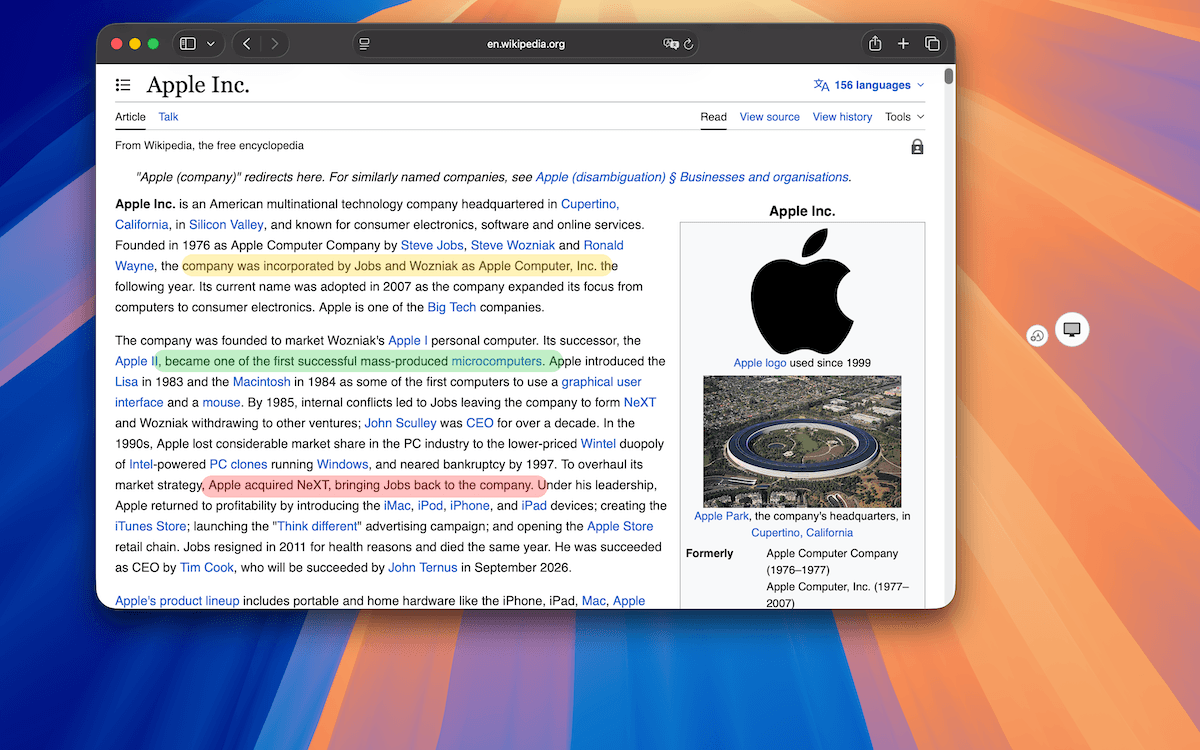
Live Canvas started from a simple question: Why do I need to take a screenshot just to point at something that is already on the screen?
During remote meetings and demos, I often wanted to draw a circle, underline a line of text, or add an arrow while continuing to use the app underneath. Traditional screenshot annotation turns a live screen into a static image. That is useful in many situations, but it changes the context. Live Canvas was an attempt to keep that context alive.
A live screen and a screenshot are different objects
A screenshot is static. Once captured, you can crop it, resize it, annotate it, move objects around, export it, or keep editing it.
A live desktop is different. Windows change, and you still need to click, scroll, type, switch apps, and continue presenting. An annotation layer over that desktop cannot behave exactly like a screenshot editor. That became one of the main design constraints for Live Canvas.
Drawing is only half of the interaction
The obvious part is drawing: an arrow, pen stroke, shape, text label, or highlight. But the harder question was, “What happens immediately after drawing?”
Imagine circling a button during a demo. Now you want to click it. If Live Canvas keeps intercepting the mouse, it becomes an obstacle. If the visual layer disappears, the explanation is gone. I wanted both: annotations remain visible, and the user can interact with the app underneath.
That led to click-through mode. Instead of treating drawing and regular desktop use as separate sessions, you can switch between them and return to drawing without ending Live Canvas. See the current controls and workflow.
That switching also needs to be fast enough to use during a live conversation.
In TrarrenShot, Live Canvas can be opened with:
Command + Shift + backtick
and click-through can be toggled with:
Command + backtick
I deliberately wanted these actions to be close to each other.
The difference between them is small:
- add
Shiftwhen you want to enter Live Canvas - remove
Shiftwhen you want to switch between drawing and interacting with the desktop underneath
The goal is not to make the user memorize a large shortcut map.
It is to make the most frequent mode transition available without moving away from the keyboard.
During a meeting or demo, even a small pause to find a toolbar control can interrupt the explanation.
A shortcut is useful here because it keeps the interaction almost invisible.
Temporary annotations have a different lifespan
A screenshot annotation is usually part of the saved output. A Live Canvas annotation might only be useful for a few seconds: “Click here.” Once everyone understands what “here” means, the mark may have done its job.
That is why automatic dismissal matters. Live Canvas lets you choose to keep annotations visible or have them disappear after a set interval. Both are valid workflows; the important thing is making the behavior useful without adding needless complexity.
The toolbar should not become the presentation
Live Canvas is often used while someone else is watching the screen, so visual noise matters. A large toolbar may be fine inside an editor, but during a demo it can distract from what you are explaining.
The option to hide the toolbar creates an unobstructed view. That is not only cosmetic; it is part of presenting while keeping annotation tools available when needed.
Why Live Canvas belongs next to screenshots
Live screen annotation and screenshot capture may look like separate products, but they address a related communication problem: I can see something—how do I show someone exactly what I mean?
Sometimes the answer is a persistent artifact: take a screenshot, annotate it, and send it. Sometimes it is a temporary interaction: draw over the live screen and keep talking. A workflow may move between both—for example, explain an idea in a meeting, then keep a screenshot for documentation. That is why Live Canvas belongs alongside TrarrenShot's capture workflow and screenshot annotation tools, rather than in a separate app.
Designing for switching, not just drawing
Building Live Canvas made me pay attention to transitions, not only “Can the app draw an arrow?” but also:
- How quickly can I start drawing?
- Can I enter Live Canvas without reaching for the menu bar?
- What happens after I finish the arrow?
- Can I switch to click-through immediately?
- Can I use the app underneath?
- Can I return to drawing without ending the session?
- Can I hide the interface when I no longer need it?
Those transitions determine whether a feature feels lightweight or intrusive. I care less about adding another annotation type than making the existing workflow require less thought.
Still evolving
Toolbar behavior, temporary annotations, shortcuts, and presentation modes are details I continue to refine. An interaction that looks sensible in a static mockup may feel wrong after repeated use during real screen sharing. I would rather test these ideas in real workflows than design from a checklist alone.
The original idea remains the same: sometimes you do not need another screenshot. You just need a faster way to point at what everyone is already looking at. That is what Live Canvas is trying to solve.
TrarrenShot
Continue reading
September 24, 2026
Why I Built TrarrenShot: A Mac Screenshot App for Real Workflows
The screenshot was rarely the hard part. The interruptions between seeing something, explaining it, and getting back to work were.
September 24, 2026
Why Screenshot Tools Break the Flow During Remote Meetings
When everyone is already looking at your screen, taking a screenshot just to point at something can add more steps than the moment needs.
September 24, 2026
Designing a Customizable Toolbar: Making Screenshot Tools Fit Different Workflows
A toolbar should not show every feature by default. Its order, visible tools, and shortcuts should fit the workflow someone has chosen.